Guidance for Developing Accessible Word Content
Microsoft Word is the primary tool used to create documents across MCCB. When used correctly, it allows content creators to build documents that are structured, readable, and accessible.
Accessible Word documents improve usability for all users and support assistive technologies such as screen readers. They also serve as the foundation for accessible PDFs.
Before You Create
Before creating a Word document, consider whether a document is the most appropriate format.
- Can this content be presented as a webpage instead?
- Is a document necessary for printing or formal distribution?
- Is this content already available in another accessible format?
The MCCB website is not a document repository. Only necessary, accessible documents should be created and published.
Creating Accessible Word Documents
Accessibility in Word is achieved by using built-in tools that provide structure and meaning to your content.
Step-by-Step Guide
Structure Your Document
- Headings
Use built-in heading styles (Heading 1, Heading 2, Heading 3) to organize content. Headings create a logical structure and allow users to navigate the document efficiently.
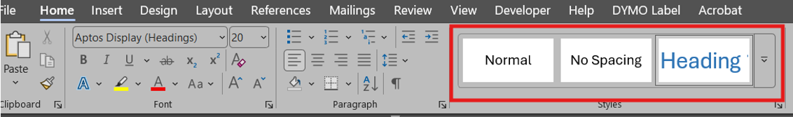
- Select text to change to a heading.
- Select Home tab, and choose the appropriate heading in the Styles panel.
- Headings 1, 2, or 3 can also be assigned using Ctrl + Alt + 1, 2, or 3 (Windows), or, Command + Option + 1, 2, or 3 (MAC), respectively.
- Lists
Use Word’s built-in list tools for bullets and numbering rather than manually typing symbols.
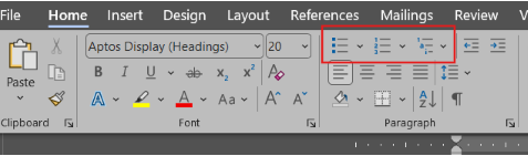
- Select the text you want to turn into a list.
- Select the Home tab on the ribbon.
- Choose the Bulleted or Numbered/Letter List option from the Paragraph group.
Format Tables Correctly
- Inserting Tables
Use tables only for data, not layout. Include a header row and keep table structures simple by avoiding merged or split cells when possible.
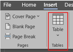
- Select Insert tab from the toolbar.
- Choose the number of columns and rows for your table by selecting the boxes from the Table dropdown menu.
- Table Design
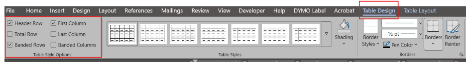
Table Design is used to format the visual layout of a table, such as styles, borders, colors, and shading, while also supporting accessibility features like properly identifying header rows and improving readability for all users, including those using screen readers.
- Select a table in your document.
- Click anywhere inside the table to activate the table tools.
- Select the Table Design tab that appears in the ribbon.
- In the Table Styles group, choose a simple, clean style (avoid overly decorative styles for accessibility).
- In the Style Options group, check:
- Header Row (required for accessibility – helps screen readers identify column headings)
- Banded Rows (optional – improves readability)
- Ensure the first row clearly describes the content of each column.
- Use Borders to clearly define table structure (avoid removing all borders unless structure is still obvious).
- Apply Shading only if there is enough color contrast between text and background.
- Avoid using merged or split cells where possible, as they can confuse screen readers.
- Keep table structure simple. Use tables for data only, not for layout or design purposes.
- Run the Accessibility Checker in Word to confirm there are no table-related issues.
- Table Layout
Table Layout is used to control the structure and organization of the table, including adding or removing rows and columns, adjusting cell size, aligning content, and managing how information is arranged. When used correctly, it helps ensure tables are clear, logically structured, and accessible to all users.
- Select a table in your document.
- Click anywhere inside the table to activate the table tools.
- Select the Layout tab that appears in the ribbon (under Table Tools).
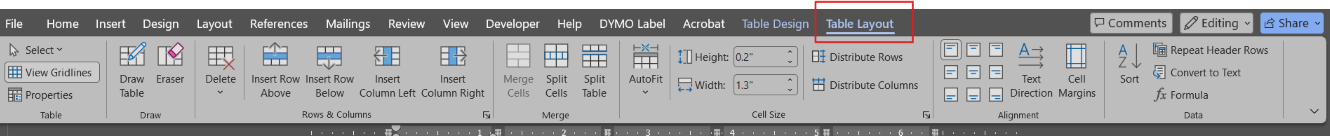
- Use the Rows & Columns group to:
- Insert or delete rows and columns as needed
- Keep the table structure simple and consistent
- Use the Merge group carefully:
- Avoid Merge Cells and Split Cells when possible, as they can create accessibility issues
- In the Cell Size group:
- Adjust column width and row height for readability
- Avoid overly narrow or crowded cells
- Use the Alignment group to:
- Align text consistently (typically left-align for readability)
- Center only when it improves clarity
- Use Distribute Rows and Distribute Columns to evenly space content
- In the Data group:
- Use Sort to organize data logically
- Use Repeat Header Rows (important for multi-page tables so headers remain visible)
- Avoid using tables for layout purposes (e.g., positioning text or images on a page)
- Run the Accessibility Checker to confirm the table structure is accessible
Use Meaningful Links and Clear Formatting
- Links
Links in Microsoft Word are used to connect users to external websites, email addresses, or other locations within a document. For accessibility, links should use clear, descriptive text that tells users exactly where the link will take them, especially, for those using screen readers, which often navigate by reading links out of context.
- Highlight the text you want to turn into a link.
- Right-click and select Link (or press Ctrl + K (Word), Command (⌘) + K (MAC)).
- In the Address field, paste the URL.
- In the Text to display field:
- Replace the full URL with meaningful, descriptive text
- Example:
- Full URL (Do not use) - https://www.example.com/report2026.pdf
- Descriptive Text - View the 2026 Annual Report (PDF)
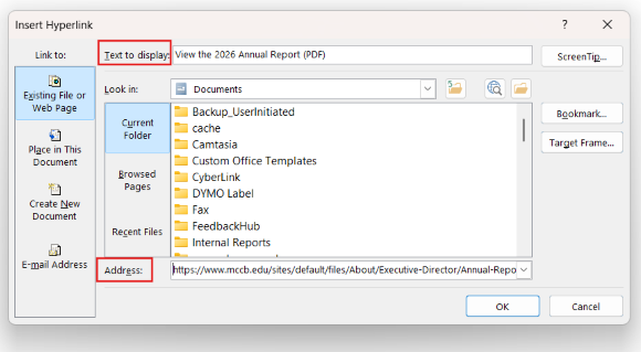
- Click OK to apply the link.
- Review your document to ensure:
- Each link clearly describes its destination
- Links make sense even when read by themselves
- Avoid using vague phrases like:
- “Click here”
- “Link”
- “More”
- If linking to a file, include the file type in the text:
- Example: Download Application Form (PDF)
- Ensure links are visually distinguishable:
- Use default hyperlink styling (blue and underlined)
- Avoid relying on color alone if possible
- Test the link:
- Click it to confirm it works and goes to the correct destination
- Run the Accessibility Checker to identify unclear or problematic links
- Color Contrast
Color contrast refers to the difference between the text color and the background color. In Microsoft Word, proper color contrast ensures that content is readable for all users, including individuals with low vision or color blindness. Good contrast improves clarity and helps meet accessibility standards like WCAG 2.1 Level AA.
How to Ensure Accessible Color Contrast in Word
- Use dark text on a light background or light text on a dark background.
- Example: black text on a white background
- Avoid low-contrast color combinations such as:
- Light gray text on white
- Yellow text on white
- Blue text on green
- Do not rely on color alone to convey meaning:
- Add text labels, symbols, or patterns in addition to color
- Example: instead of only using red text for errors, include “Error:”
- Apply color using the Home tab:
- Use Font Color for text
- Use Shading for background (tables or highlighted areas)
- Choose simple, high-contrast theme colors:
- Avoid overly decorative or custom color palettes
- Be cautious with hyperlinks:
- Ensure links are clearly visible (default blue + underline is best practice)
- Avoid using images or shapes with text that have poor contrast
- Use built-in styles when possible:
- Word’s default styles are generally designed for readability
- Check contrast using tools:
- Use Word’s Accessibility Checker
- Optionally verify with external contrast checkers
- Test readability:
- Zoom out or print preview to see if text is still easy to read
- Ask: “Can this be read quickly without strain?”
Quick Rule of Thumb: If you have to squint or focus harder to read it, the contrast is probably too low.
- Use dark text on a light background or light text on a dark background.
- Add Text Alternatives
Provide descriptive alt text for all meaningful images. Decorative images should be marked appropriately so they are ignored by assistive technologies.
- Right-click on the image and select Format Picture. A pane will appear to the right of your screen.
- Select the alt text icon.
- Enter appropriate Alt text in the Description field. You can also select Generate alt text for me. This is an AI feature that will generate an alt text for you. Note: always read the generated text before approving it.
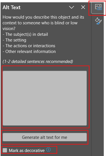
Other tools that can help you generate alt text:
Check Accessibility
- Microsoft Word Accessibility Checker
The Accessibility Checker in Microsoft Word is a built-in tool that scans your document for accessibility issues. It identifies errors, warnings, and tips to help ensure your content is usable for people with disabilities, including those using screen readers. It also provides guidance on how to fix each issue.
- Select the Review tab in the ribbon.
- Click Check Accessibility.
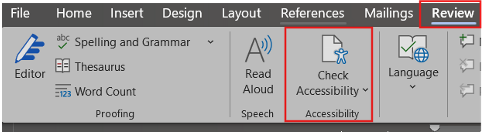
The Accessibility pane will open on the right side of the screen.
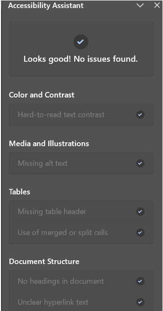
- Review the results, which are grouped into:
- Errors (must be fixed – critical accessibility issues)
- Warnings (should be reviewed – may impact accessibility)
- Tips (help improve overall usability)
- Click on an issue to:
- Jump directly to the affected content
- View instructions on how to fix it
- Follow the recommended steps to correct each issue.
- Re-run Check Accessibility after making updates.
- Continue reviewing until no critical errors remain.
- Perform a quick manual check for:
- Clear headings and structure
- Descriptive links
- Simple table layouts
- Save your document once all issues are resolved.
Exporting to PDF
- Exporting to PDF in Word
Exporting to PDF in Microsoft Word allows you to share a document in a fixed, widely accessible format. However, to maintain accessibility, the PDF must be created in a way that preserves structure elements like headings, links, and table tags. Using the correct export method ensures the PDF remains usable for screen readers and meets accessibility standards.
- Complete your document and run the Accessibility Checker to fix any issues.
- Select File from the top menu.
- Click Save As (or Export, depending on your version).
- Choose the location where you want to save the file.
In the Save as type dropdown, select PDF (*.pdf).
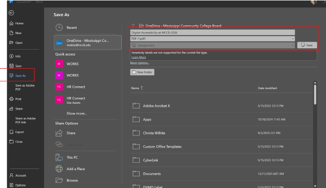
- Click Options before saving.
- In the Options window:
- Ensure Document structure tags for accessibility is checked (this is critical)
- Ensure Create bookmarks using: Headings is selected (helps with navigation)
- Click OK, then select Save.
- Open the exported PDF to verify:
- Headings are structured and navigable
- Links are clickable and descriptive
- Tables are readable and properly formatted
- (Recommended) Open the PDF in Adobe Acrobat Pro and run the Accessibility Check for final verification.
Tools and Resources
Support Pages
- WebAIM Contrast Checker
- Make your Word documents accessible to people with disabilities (Microsoft)
- Microsoft Word: Creating Accessible Documents (WebAIM)
- Creating Accessible Documents in Microsoft Word (Univ of Washington)
- Microsoft Word Accessibility (Michigan State)
- VIDEO (54:41) Creating Accessible Word Documents (Univ of Alabama)
- VIDEO (4:56) Creating Accessible Word Documents (National Clearinghouse of Rehabilitation Training Materials)